TechStyle Responsive Landing Page Case Study
Techstyle produces thousands of Landing Pages for its fashion brands as a gateway into their full website and/or introductory quiz. As mobile traffic began to overtake destkop traffic to these pages, and website trends and standards demanded mobile-first / responsive design, the old way of producing these pages via slicing large flat images of page layouts seemed outdated, inefficient, inconsistent and load-heavy with zero live text for SEO crawlability. A responsive site would also eliminate the redundancy of builidng a mobile and desktop version of a page.
Not only did I have to develop a new responsive framework that will deliver modern looking and fast-loading pages to site visitors, the template needed to be lightweight and versatile to work with the existing established production platform within the company and the production workflow needed to make sense within the development teams. There needed to be good UX design for both the site visitors as well as the site designers creating them.
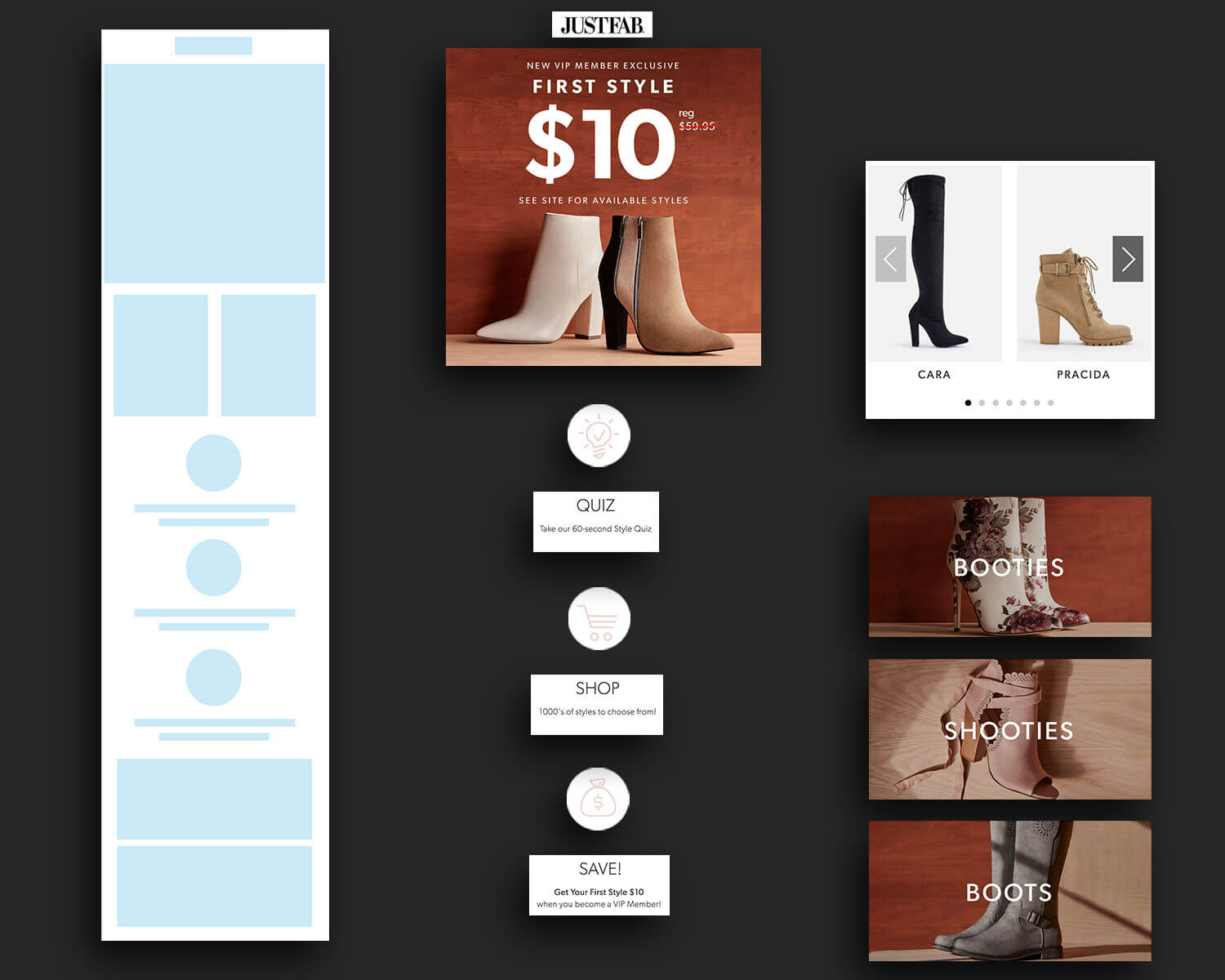
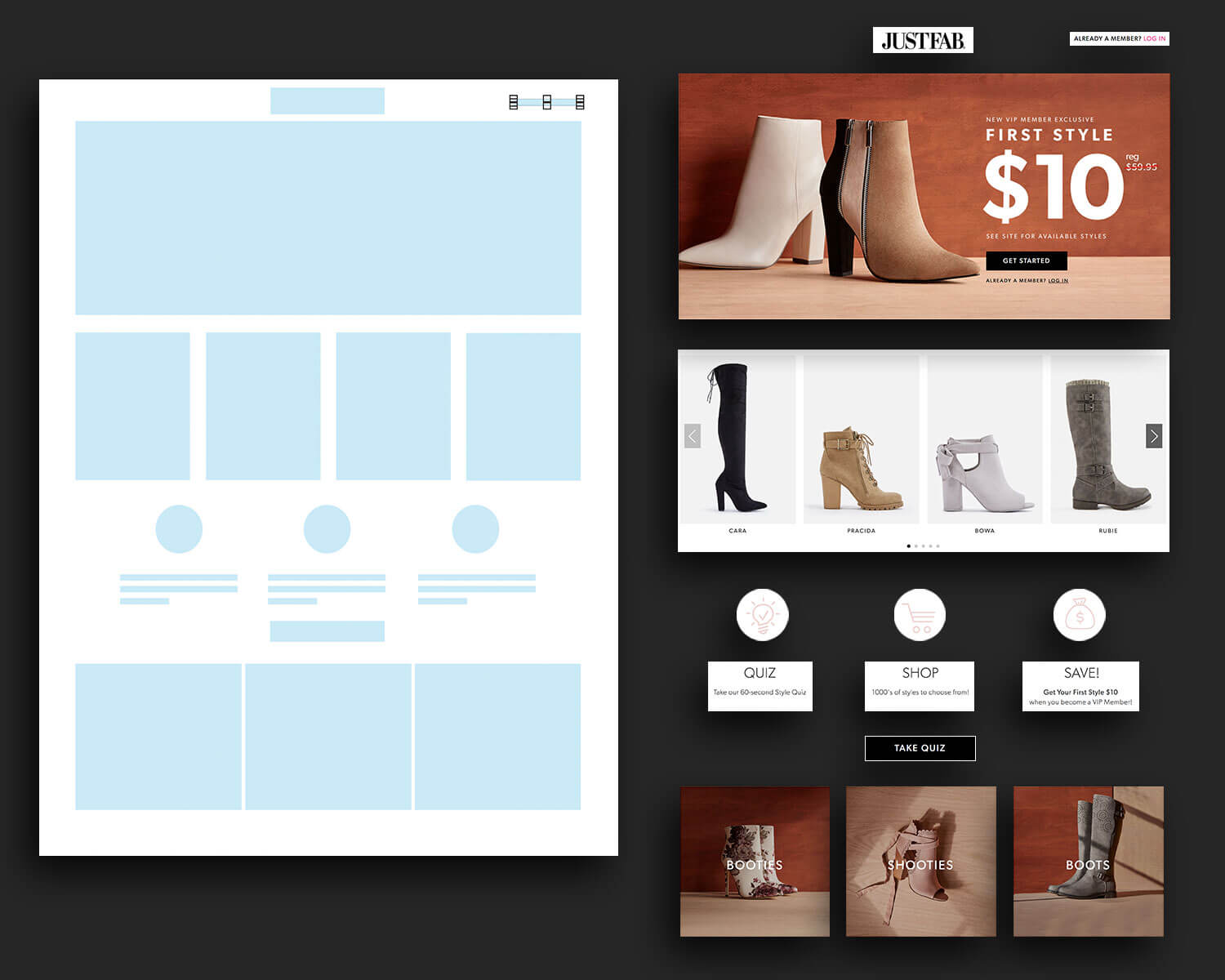
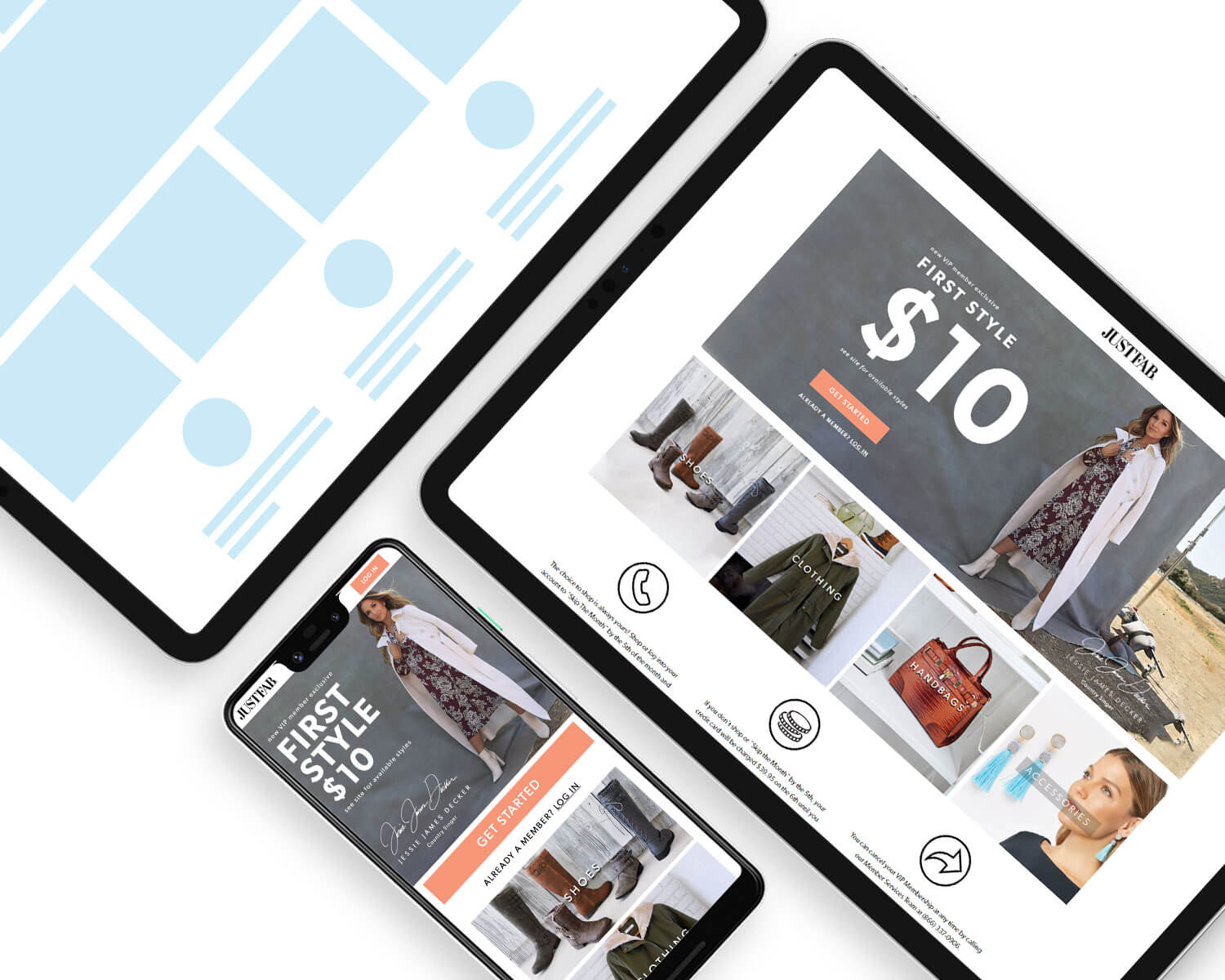
Since we already collected A/B test results on which LP layouts performed best, I studied these layouts and extracted similar elements of each page that could be built into separate content block/modules for the new responsive template. Most successful pages included elements like header and footer Hero image, a slider of product images, 3 or 4 category sections, and a 3-step How It Works section. These content blocks would build the first iteration of a responsive template.
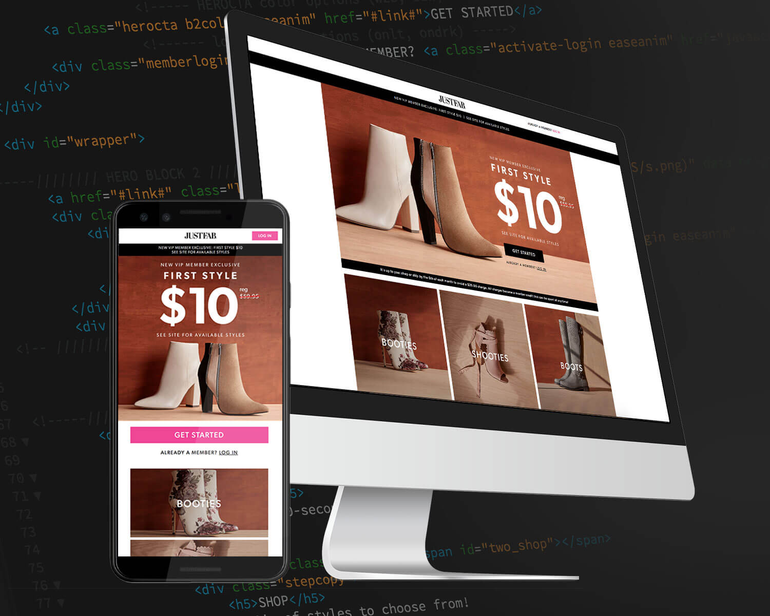
I began wireframing what these pages would look like on mobile and desktop - developed guidelines on where a call-to-action would be positioned within these hero blocks, how many product images would show at a time in a slider, how category blocks collapsed between mobile and desktop views. After wireframing and mocking up what these pages would look like with real images and content, I began the coding process from scratch. I decided against using any established framework like bootstrap because I wanted it to be as lightweight as possible and also didn't want it to possibly conflict with any other already established code. With the exception of the lazyload and swiper.io Javascript that I found via online communities, all CSS and HTML is uniquely and originally written by myself and to only work for this responsive template.
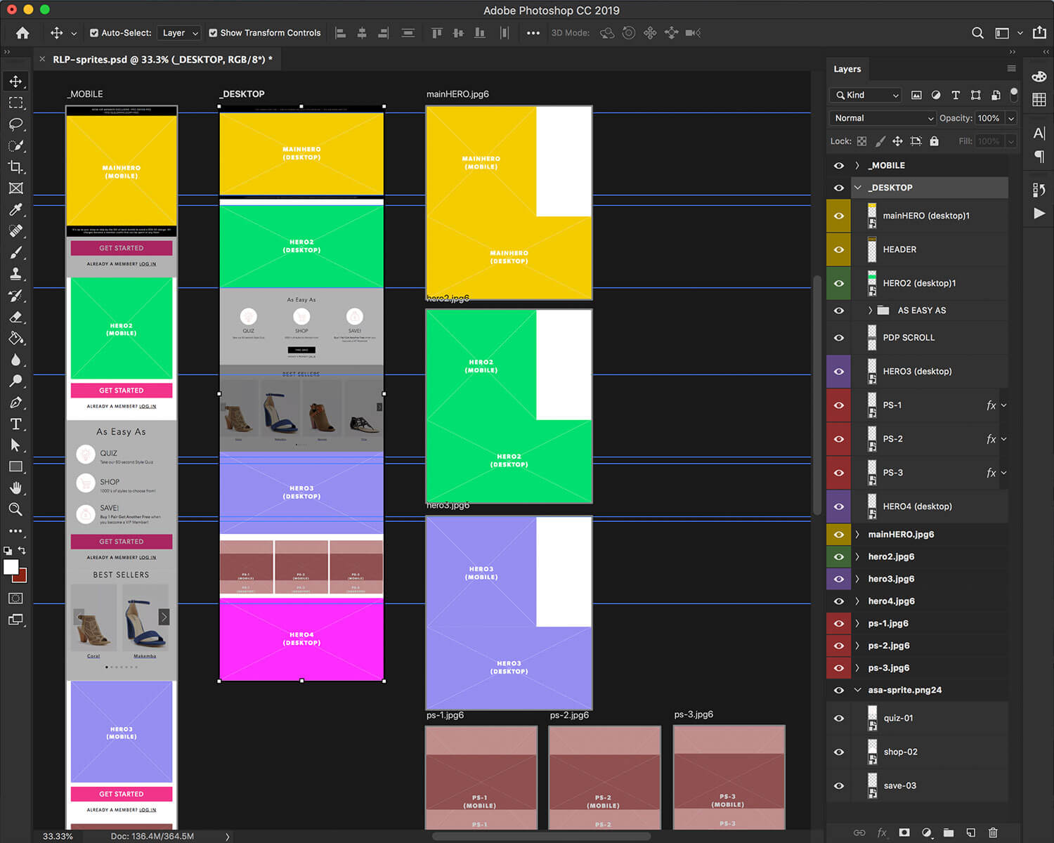
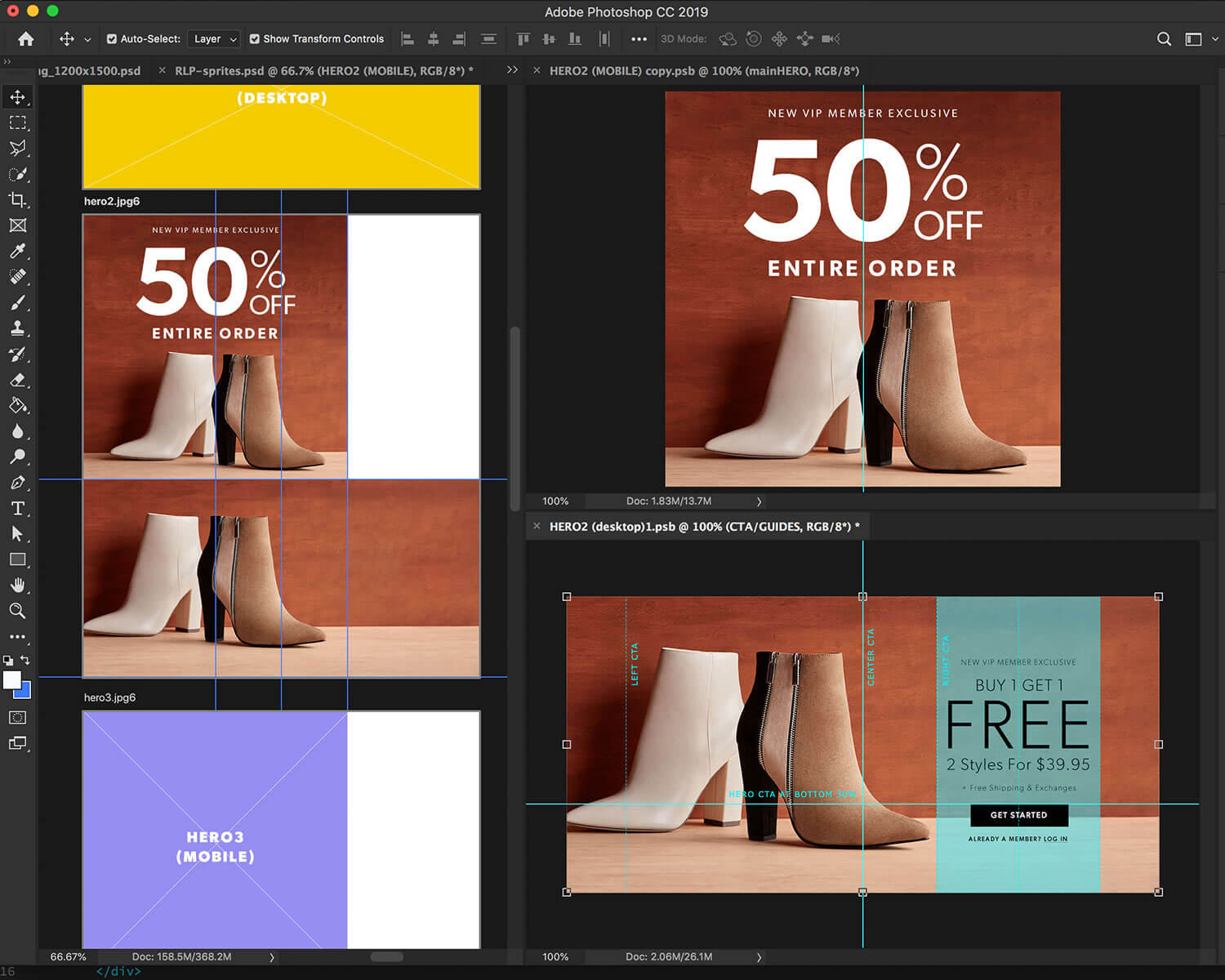
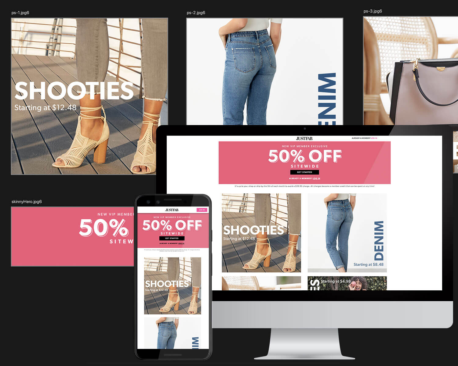
The responsive template had tested well amongst the team and the actual customer base. The next step for this template to be scalable and efficiently useable by other desingers on the team was to redesign the workflow process as well as create assets easily duplicated, reskinned and built-upon on a project to project basis. I created a PSD with artboards that automatically generated image spirte assets for all content blocks used in the template, as well as a mobile and desktop layout generated by the same artboards, to help as a visual aid to the designer. HTML code blocks are clearly marked and sectioned to allow for easy rearrangement within template. Finally, I created documentation with screenshots and instructions to guide the designer step by step: Design, Export, Upload, Publish.
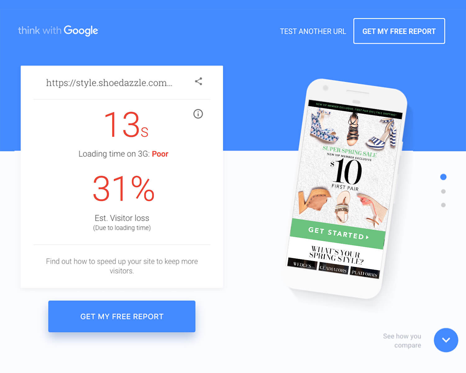
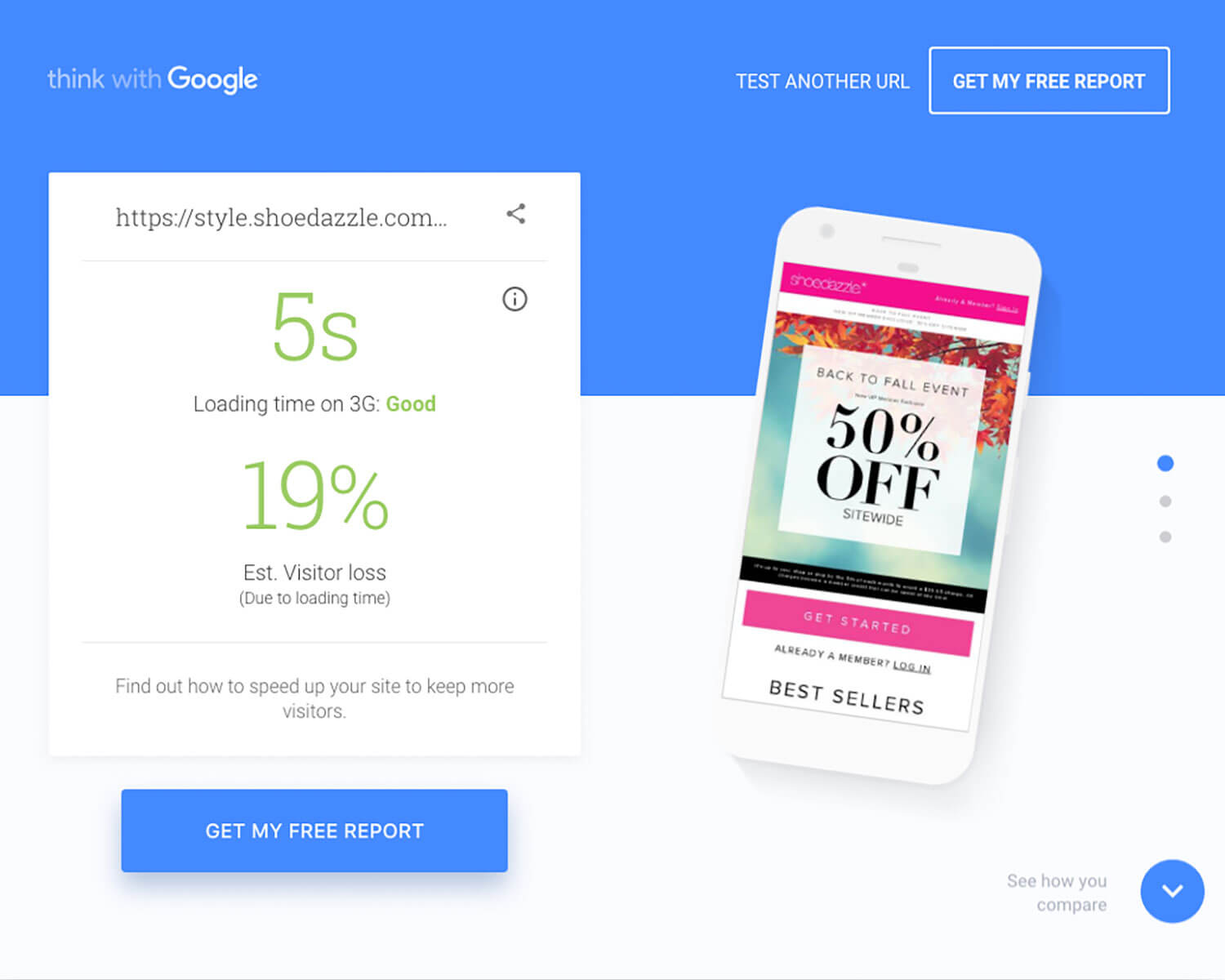
After months of debugging, testing, and feedback-looping from the team, beta version was ready for limited release and ready to be tested against and old, heavy, non-responsive page. I ran both pages through Google's TestMySite to test for site speed and recorded an amazing drop in load time from ~13 secs to ~5 secs. Click through and bounce rate slightly improved.
The workflow process greatly improved with the Responsive Template. Old pages, from design to launch, had a turnaround time of 3 days per landing page. The new responsive template, with enough practice, had a quick turn around time of less than 1 day per landing page.